WEBSITE DESIGN & DEVELOPMENT
Responsive Web Development.
Responsive Web Design is a technique that allows the site to adjust to the size of the screen it is being viewed on.
Play Video about Responsive Design
Responsive Web Design is a technique that allows the site to adjust to the size of the screen it is being viewed on.

From desktop to tablet to mobile, 6dimensions.com looks great on your smartphone, tablet, and computer. It’s easy to read, easy to navigate, and easy to use on any device. It’s the difference between a site that works for you versus a site that works on you!
Our responsive website technology adapts to fit your device. That means that content is positioned automatically for a better reading experience — from computer screen to smartphone. You’ll always get the best version of our site: the one that looks great on your screen!
You’ve probably heard about the impact of mobile devices on the information industry. The stats say that there are over 50 million websites in operation today, but only 2 million are built for mobile users in mind. A responsive design ensures that your customers can access your website from all types of devices with ease!
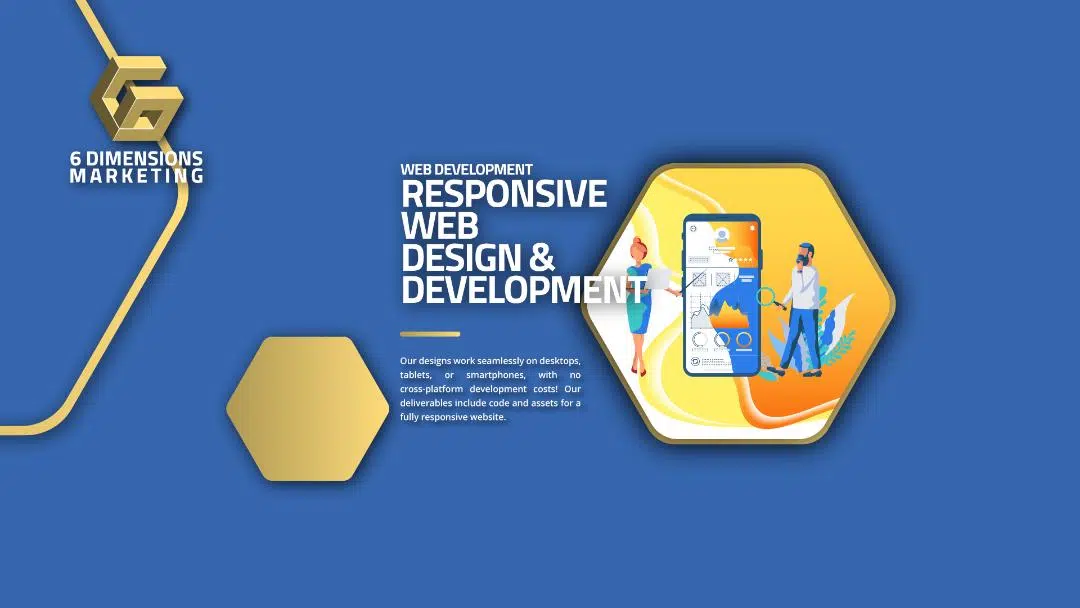
Our designs work seamlessly on desktops, tablets, or smartphones, with no cross-platform development costs! Our deliverables include code and assets for a fully responsive website.


Our designs respond to the viewer’s device, platform, orientation, and screen size. We embrace mobile-first design methodology from the outset.
We take a mobile-first approach to our design methodology. We test each deliverable thoroughly in the most popular mobile devices and browsers before delivering it to you.
People may be using different devices to view your website, but your website should look good on all of them!


We are a digital marketing agency in Toronto, Ontario. We develop engaging strategies for websites, blogs, social media, and email campaigns designed to help your business connect with people everywhere.


Join 2,000+ other business founders/marketers to learn about Creative Strategy, Facebook Ads, and more…